28.08
Share ArticleFootprint graphics for traders: An insider's view of the market

Success in trading depends on the ability to read between the lines and recognise hidden market signals. Footprint charts are a unique tool that allows traders to get to the heart of market movements by studying the interaction between buyers and sellers at a detailed level. These charts open the door to a deeper understanding of market dynamics, allowing you to anticipate trends rather than just follow them.
What is a footprint?
A footprint is a chart that shows the interaction between buyers and sellers at a detailed level. It is used to study the transactions themselves, rather than the trends they form. The Footprint chart was invented 20 years ago (in 2003) by a company that no longer exists. However, most major trading platforms offering services to professional traders have adopted it under different names.
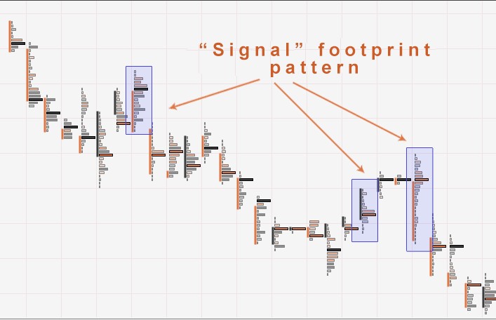
A footprint chart is a multidimensional model of a candlestick chart. It shows traders the trading volume at each price level. It is first and foremost a candlestick, but not like any other. Its annotations indicate how trades were made on a given bar. The footprint chart gives detailed information about what actually happened when a particular candle was made. The left side of the footprint chart shows the sellers (in red) and the volume they sold at each price level. The right side of the fingertip footprint chart contains the buyers and details of the volume they bought at each price level.
A cluster (a given grouping or line) of type B x A indicates the number of ‘B’ lots sold and the number of ‘A’ lots bought at a given time. Therefore, footprint charts are used by traders to study orders executed on a candlestick chart to understand the interaction between buyers and sellers.
Types of footprint graphs
There are three types of footprint charts in the trading world:
- Delta: Shows the difference (A-B) between the number of lots bought and sold at a given price. Thus, the number in each line of the delta represents the result of subtracting the items on the right line (Ask) from the items on the left line (Bid) of the Bid/Ask chart. The simple fact that there is data at different price levels on the difference in volume between sellers and buyers can allow traders to identify the most aggressive part of the market. This information also allows to confirm doubts about a potential trend change.
- With this tool, you can focus your analysis on one branch depending on the direction of the trade you are looking for and display only sellers or only buyers;
- Volume: The volume chart shows the total number of contracts traded at each price. This is useful when you want to know price levels and points of interest for buyers and sellers;
- Bid/Ask: The most common of the different types of footprint charts. Over a given period, it shows the number of contracts sold at bid and ask prices. Buyers are on the right (often in green) and sellers are on the left (often in red).
How to analyse footprint charts?
When analysing footprint charts, traders try to identify signs that indicate the importance of a certain price level, confirmed by transaction activity. This can manifest itself as a volume imbalance between buyers and sellers, significant volume leading to acceleration (Order Block), or areas where large volumes are accumulating (high volume node). Another important signal is an unfinished auction, which can herald a change in trend.
In an uptrend, when there are no buyers at the top of the candle, we can say that the auction is complete. Similarly, in a downtrend, when there are no sellers at the bottom of the candle, the auction is also considered closed. This often indicates that the trend may be weakening.
However, if in a downtrend there is continued selling at the bottom of the candle or in an uptrend there is continued buying at the top of the candle, the auction is not yet considered complete. Trends are like magnets, attracting the price to close the auction. This approach to data analysis helps traders better understand the intentions of market participants, and the various types of displays available for analysis make the process even more convenient and efficient.
Types of displays to analyse
Footprint charting provides several types of data displays. One of these types is VPOC, which highlights the price level with the highest trading volume. Depending on the market context, this level can play the role of both support and resistance, influencing further price movement. Another useful tool is the median, which divides a candle into two equal parts, making it easier to distinguish between different market profiles, such as p- and b-profiles.
Equally important is the volume profile, which shows the distribution of volume at different price levels. This display is particularly useful for examining market profiles in detail and clarifying information related to p- or b-profiles. In addition, there is the option of using custom colouring, which allows the trader to adjust the colour display of different price levels according to preset values. This makes it possible to highlight those levels that are most important in the current trading strategy, making data analysis more personalised and convenient.
Footprint strategies
In order to build your trade, you need to be able to see the big picture or use context. Therefore, the strategies discussed below should be used in context and for deeper analysis:
- Support/Resistance (naked VPOC): One of the simplest strategies is to find the VPOC of significant candles. To do this, you look for unproven (naked) candles with a high/low/breakout. When price comes back to test the detected VPOC, the probability of price making a pullback is very high;
- Reversal: To use this strategy successfully, it is important to visualise the volume profile or median. Traders look for candles with a p or b volume profile as they can signal a trend reversal. If volumes are concentrated at the top of the candlestick (p profile), it portends lower prices. If the volumes are in the lower part (profile b), the market is likely to rise. This approach helps to recognise a possible change of direction in time and adjust trading decisions;
- Stacked imbalance (high volume node): Once you detect these areas, they act (depending on the type) as support/resistance (supply/demand) zones. This allows you to see potential rebound zones.
Don't forget that you can combine some of these strategies to optimise your entries into the financial markets.
Conclusion
Mastering footprint charts allows you to delve deeper into market analysis, revealing the interactions between buyers and sellers on a micro level. Traders can not only predict trends, but also more accurately choose when to enter and exit trades. The use of footprint charts transforms trading from an intuitive exercise into a sound and considered strategy, significantly increasing the chances of success in the world of financial markets.


Reviews